Finally, Xiaomi’s top flagship: the Xiaomi 13 Ultra has been officially launched. Thinking back to last year’s Xiaomi 12S Ultra, it was great, but users in regions other than China simply couldn’t buy it. Various sources have proven that the Xiaomi 13 Ultra is definitely going to be announced globally. So why not come along with us and see what’s in the box of Xiaomi’s peak mobile phone? You’ll be impressed a lot.
Unboxing
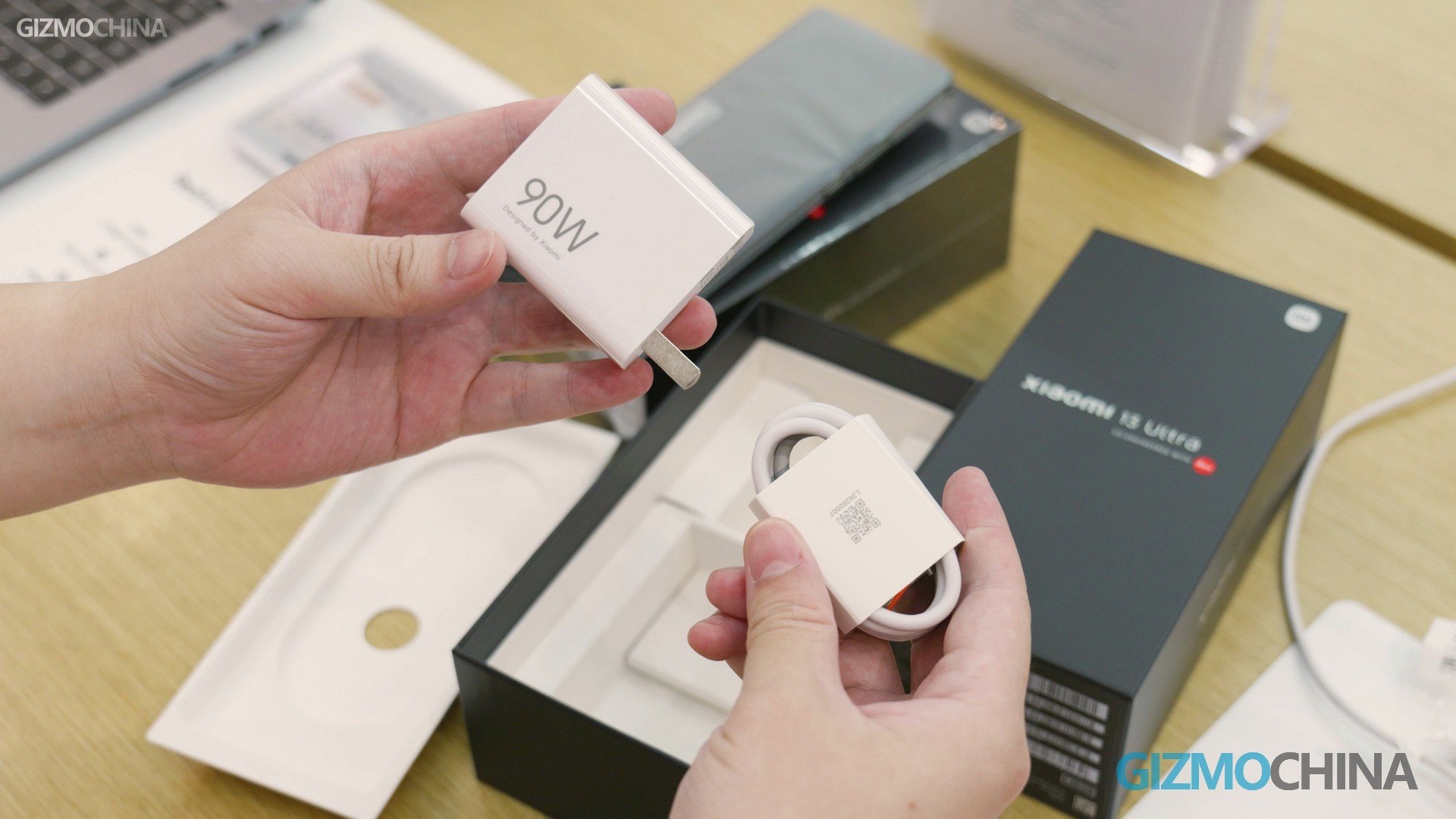
The most obvious difference between the Xiaomi 13 Ultra and the 12S Ultra is that there is an extra white colorway. But unfortunately Xiaomi Store currently only has green and black on the shelf, and I can only bring you the green version unboxing. We all know that no matter how expensive Xiaomi’s phones are, the complimentary accessories are relatively ordinary, so let’s see if it will be better this time.
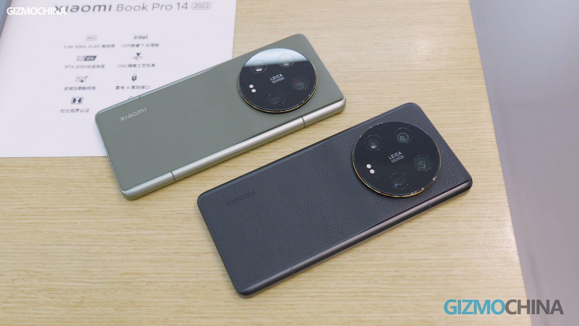
Open the lid and we can see what’s inside this little box. The regular card pins and instructions, and the phone case. This case is not the same as the previous transparent case, the black plastic surface has a leather-like pattern. Very thin, much better than the previous one.
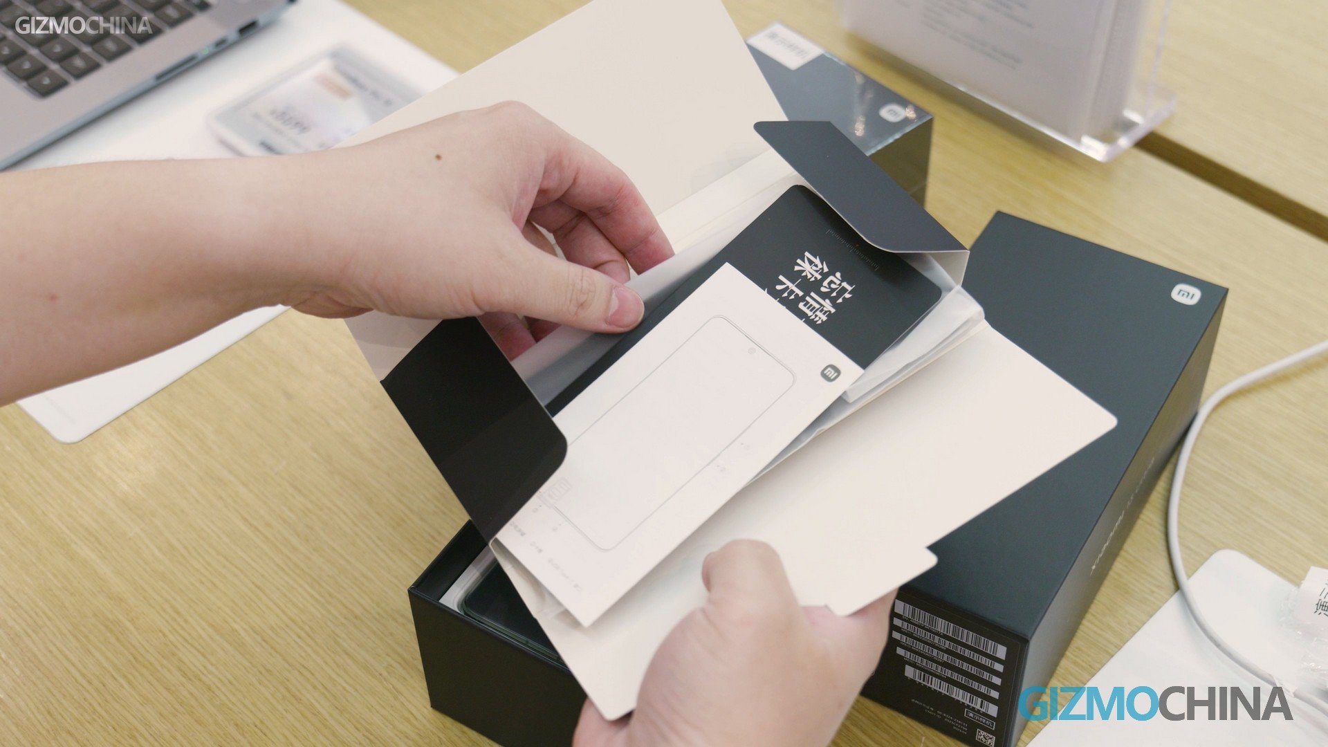
Let’s take the phone out and put it aside for now, first we can see the accessories. Not surprisingly, underneath the phone lies the charger and charging cable, the charger is still a USB-A port, but the power has increased to 90w. while the size is similar to the previous 67w.
Hands-on
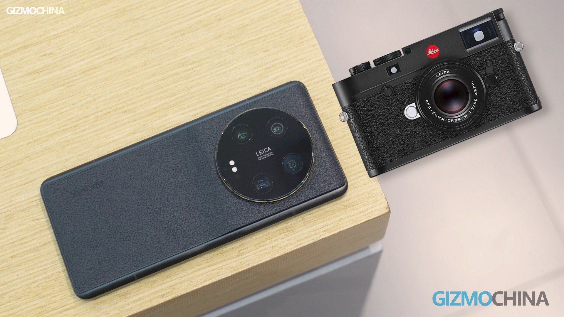
Let’s take a look at this new phone. At first glance, it looks a bit like the 12S Ultra, but it’s completely different when you look closer. 13 Ultra’s frame is different from normal phones, not only is it flat, but the metal frame also extends to the back panel. The back panel is also raised at the camera module part, to make the camera look less protruding.
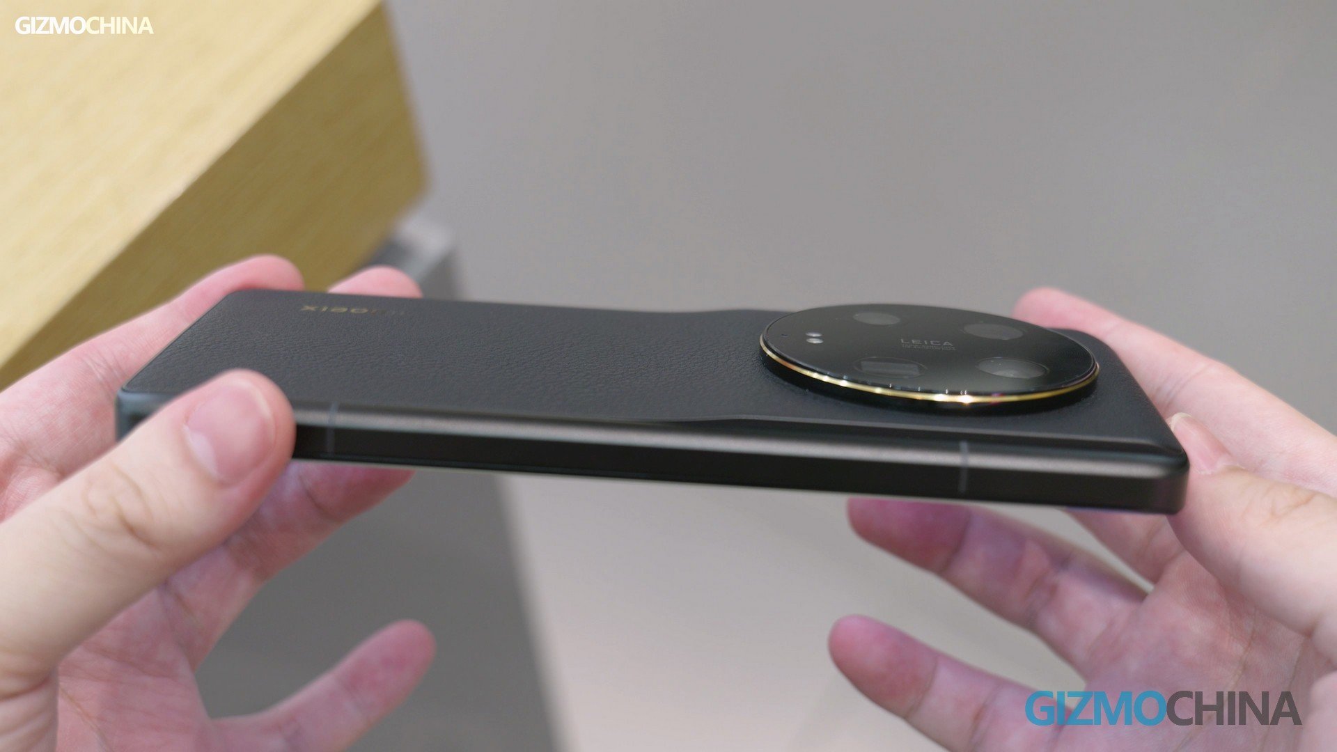
Except for the absence of the red Leica logo, it is very much like the Leica M10 look. Xiaomi 13 Ultra dares to launch the white leather version this time because its back panel is actually more like silicone than “leather”. It’s more durable and more resistant to dirt. But considering that my 12S Ultra’s corners have been worn flat, I wouldn’t trust them.
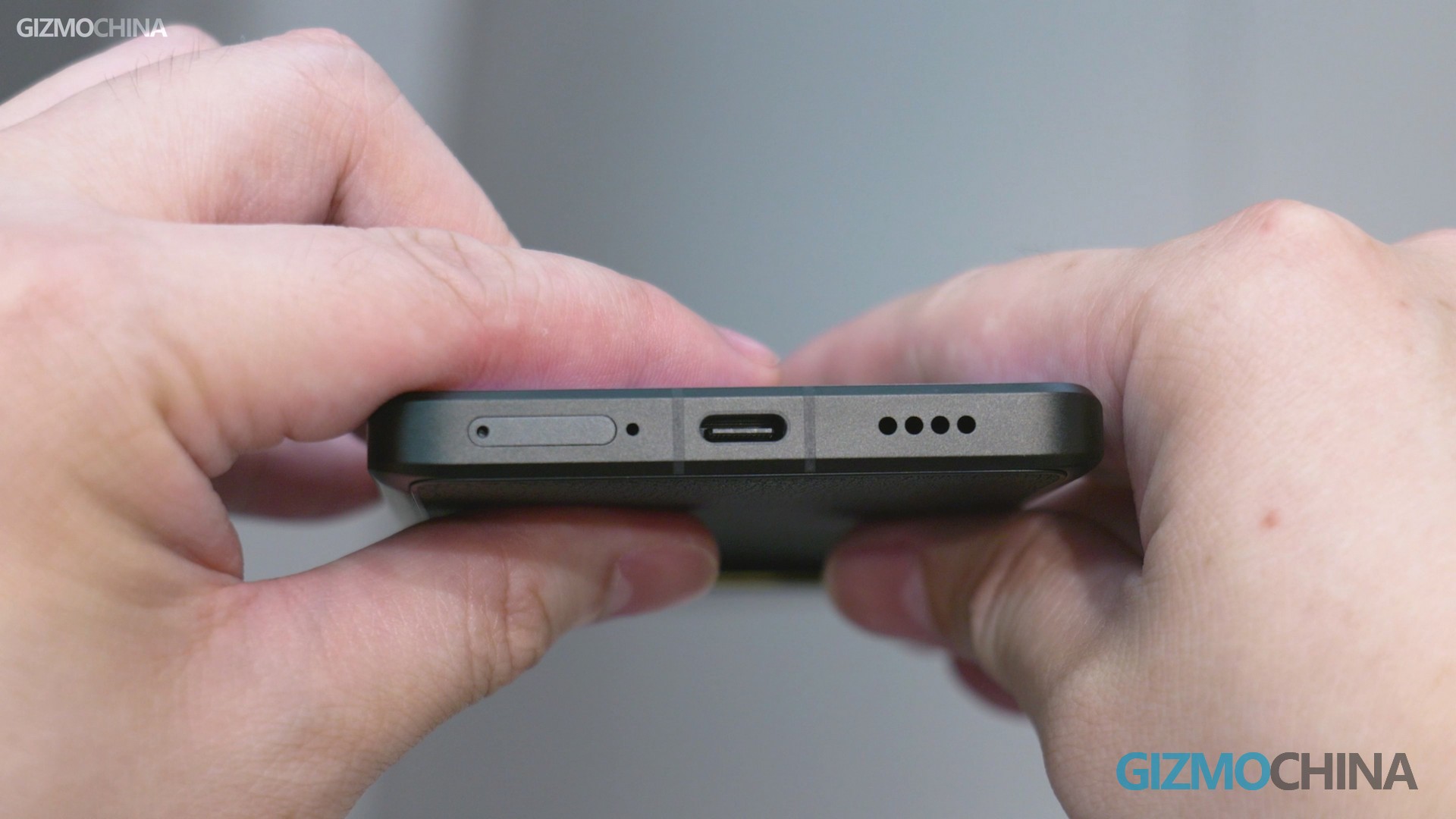
It has NFC and IR Emitter. But there is no headphone jack and no more Harman Kardon logo. Weight and size have not changed much compared to the 12S Ultra. If you have to ask me whether it’s comfortable to hold? My answer is more comfortable than I thought. The frame design doesn’t affect the feel too much, however, it is really heavy and thick. Your hands aren’t exactly comfortable for long periods of time.
So that’s what I would say about the design of the Xiaomi 13 Ultra: a beautiful phone that sacrifices feel in hand to look as much like a Leica camera as possible.
Display
Xiaomi 13 Ultra does not use Samsung’s screen this time, it is the latest C7 panel from TCL. This is not the first time Xiaomi has used a TCL panel on its top-of-the-line flagship phone, since the Mi 10 Ultra did the same thing. But at that time, TCL couldn’t make a screen comparable to Samsung’s, but this time, it did.
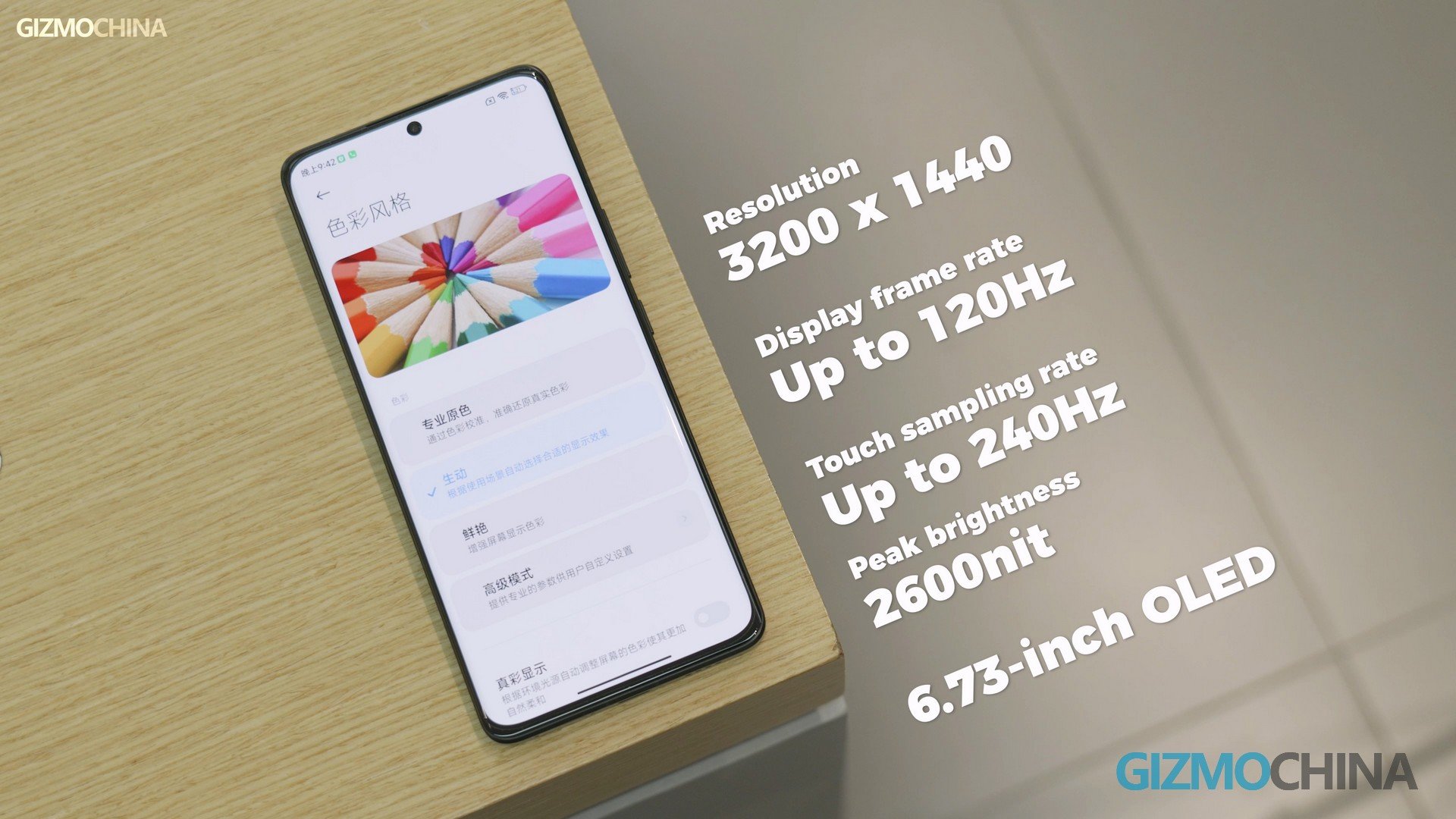
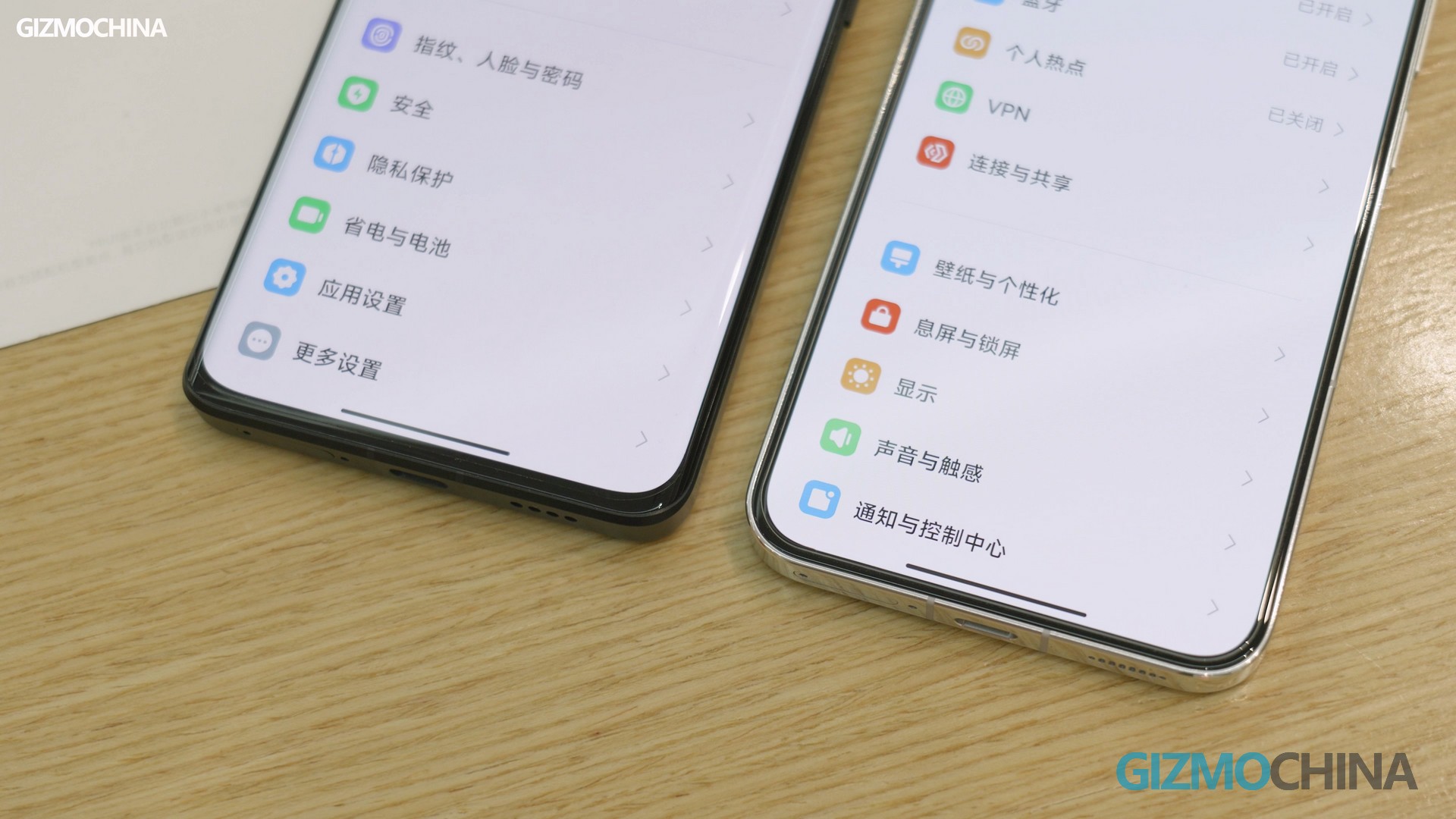
In terms of specs, it’s almost perfect. I didn’t find any drawbacks in my short hands-on time either. Oh, if there’s one thing I’m not satisfied with, it’s probably the width of the bezel. I’ve recently gotten used to the ultra-narrow bezels of the Xiaomi 13, and I feel like the 13 Ultra could do better.
We’ll leave the testing of the 13 Ultra’s performance and camera to the FULL review video. After all, it’s not officially on sale yet, and I don’t know how good it really is. Remember to subscribe to our YouTube channel. We will also do a review of the Xiaomi Band 8 and Pad 6 Pro later.
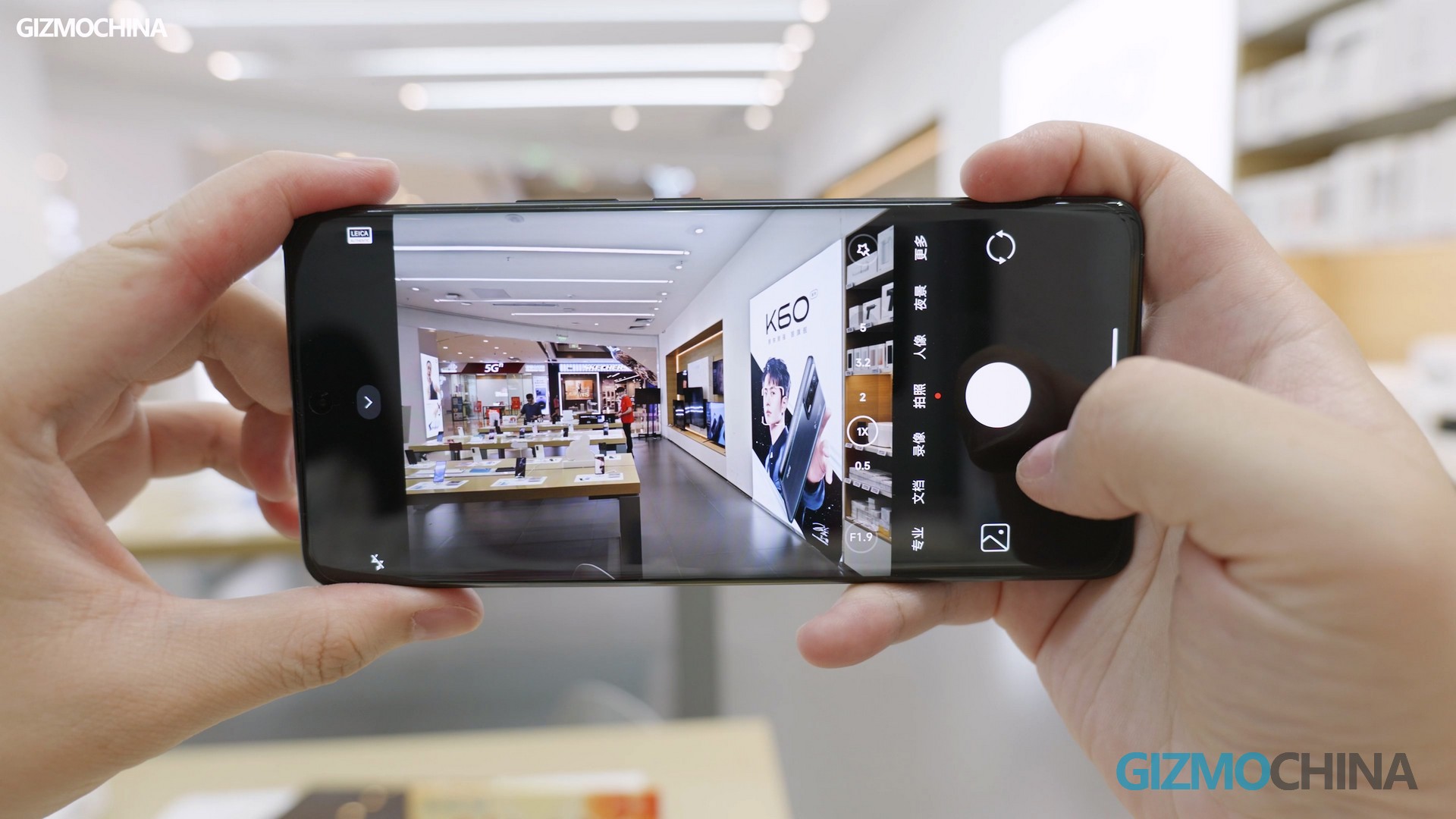
After this short hands-on experience, I finally know that Xiaomi has changed the way they think about making phones. They are making a camera that can make phone calls. Xiaomi is telling you that if you don’t like big and heavy phones and you are not interested in photography, buy the Xiaomi 13. If you like photography, especially if you are a fan of Leica. Then this 13 Ultra is the dream phone for you.


